While much of the progress on War Worlds to date has been in relation to various back-end systems (such as chatting), I also like to take time out to improve the looks of the game as well. After all, that's the kind of thing that keeps me motivated!
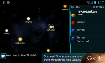
So with that in mind, check out the following screenshots:
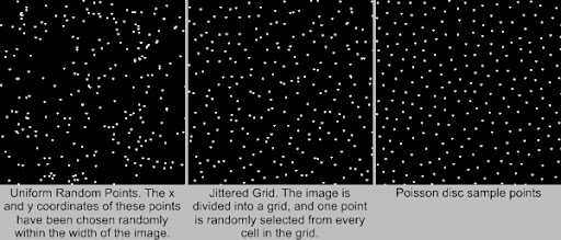
Not only does it render the the background now, but the starfield generation algorithm has changed quite a bit. Previously, I was simply generating a random number to represent the number of stars in a sector, and then placing those stars at random locations around the sector. The problem with that is it results in "clumping" which, while perfectly random, is still not nice to look at. More details of the algorithm I used can been see here, but you can see an example of random distribution of points vs. a Poisson distribution in this picture:

The left hand side shows what I was doing, the right hand side shows (approximately) what I'm doing now. I'm sure you'll agree it looks much better.
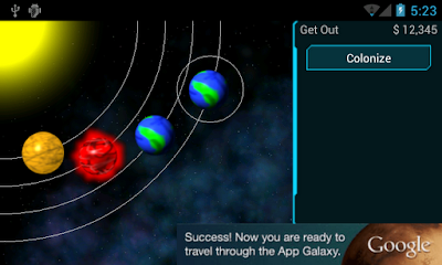
You might also notice the little " " icon next to one of the stars above. That icon indicates the presence of a colony on one of the planets around that star. You can also see the planet list in the column on the right (this will just be a "summary" of the planets), tap on it to get more details and you'll see:
This view is still pretty much the same as what you saw before (except now there's a nice background as well). But this will be where most of the "action" happens in the game. That is, it'll be where you adjust your colony's output, colonize planets, attack and so on.
Work in progress!


